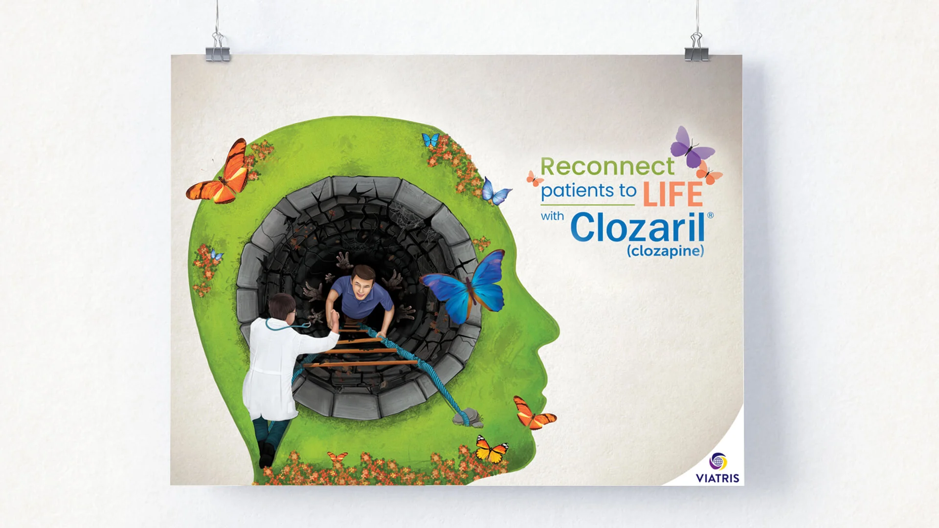
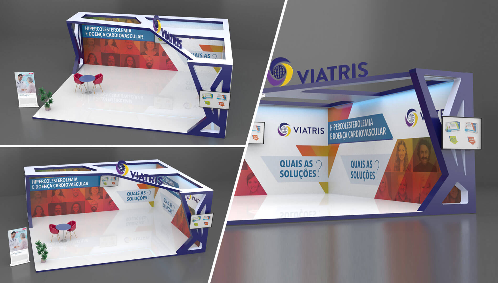
Beyond ordinary. We craft stories that engage
PlasmaGen BioSciences is an Indian biopharmaceutical company focused on Plasma Protein and Specialty Care Therapy. They are dedicated to improving the availability of plasma products for patients. With a diverse range of immunoglobulins, they serve various medical fields such as Haematology, Oncology, Immunology, Paediatrics, Rheumatology, Dermatology, and Neurology.

Plasmagen approached us to rebrand their old logo. Our objective was to design an identity that accurately reflected the Plasmagen brand and effectively showcased it's expertise in the specialist plasma manufacturing industry. We aimed to create a new logo that would capture the essence of Plasmagen's unique capabilities and establish a strong visual presence in the market. Our goal was to develop a logo that would not only resonate with their target audience but also communicate Plasmagen's authority and excellence in the plasma industry.

PlasmaGen BioSciences, an Indian biopharmaceutical company specialising in Plasma Protein and Specialty Care Therapy, is seeking to improve its brand recognition and market presence. After conducting research and brand analysis, it was found that the company's old brand identity was not resonating well with the target audience due to its complex and ineffective logo design. As a result, PlasmaGen has decided to undergo a complete rebranding process to establish itself as an industry expert and differentiate itself from competitors. The goal is to create a corporate identity that aligns with the company's values, attributes, purpose, and strengths.

Our idea was to create a typography logo for Plasmagen that truly represents our organisation's identity and values. We aimed to design a logo and a brand manual that would effectively communicate who Plasmagen as an organisation are and what they stand for. After careful consideration, we decided to use two distinct colours, blue and orange, to differentiate "Plasma" and "Gen." The colour blue symbolises trust, stability, and intelligence, which align perfectly with core principles of the organisation. On the other hand, the vibrant orange represents positivity and energy, reflecting passion and commitment to making a difference.

To bring our idea to life, we developed a typography logo style for Plasmagen. The word "Plasma" is presented in blue, while "Gen" is in orange. This colour choice ensures clear separation and enhances the visual appeal of the logo. In addition, we designed the letter "g" using elegant oval shapes. These ovals represent the pillars of Safety, Care, and Quality, emphasising the organisation’s dedication to these essential aspects. The oval shapes also convey a sense of completeness and unity, reflecting the commitment to excellence. Overall, this typography logo style, with its carefully selected colours and meaningful shapes, effectively communicates Plasmagen's values of quality, reliability, and exceptional products and services.


Registered Office :
Skepper Creative Agency Private Limited
164, 2nd Floor, Dr. Shivaram Karanth Nagar, MCECHS Layout, 80 Ft. Road, Bangalore-560077, Karnataka, India.
Dubai Office :
Skepper Web Design
Office 12, Mind Space, 19th floor, The Prism Tower - Business Bay - Dubai - United Arab Emirates
Creative Development Center :
#7/598, Nadavayal, Wayanad, Kerala, India.